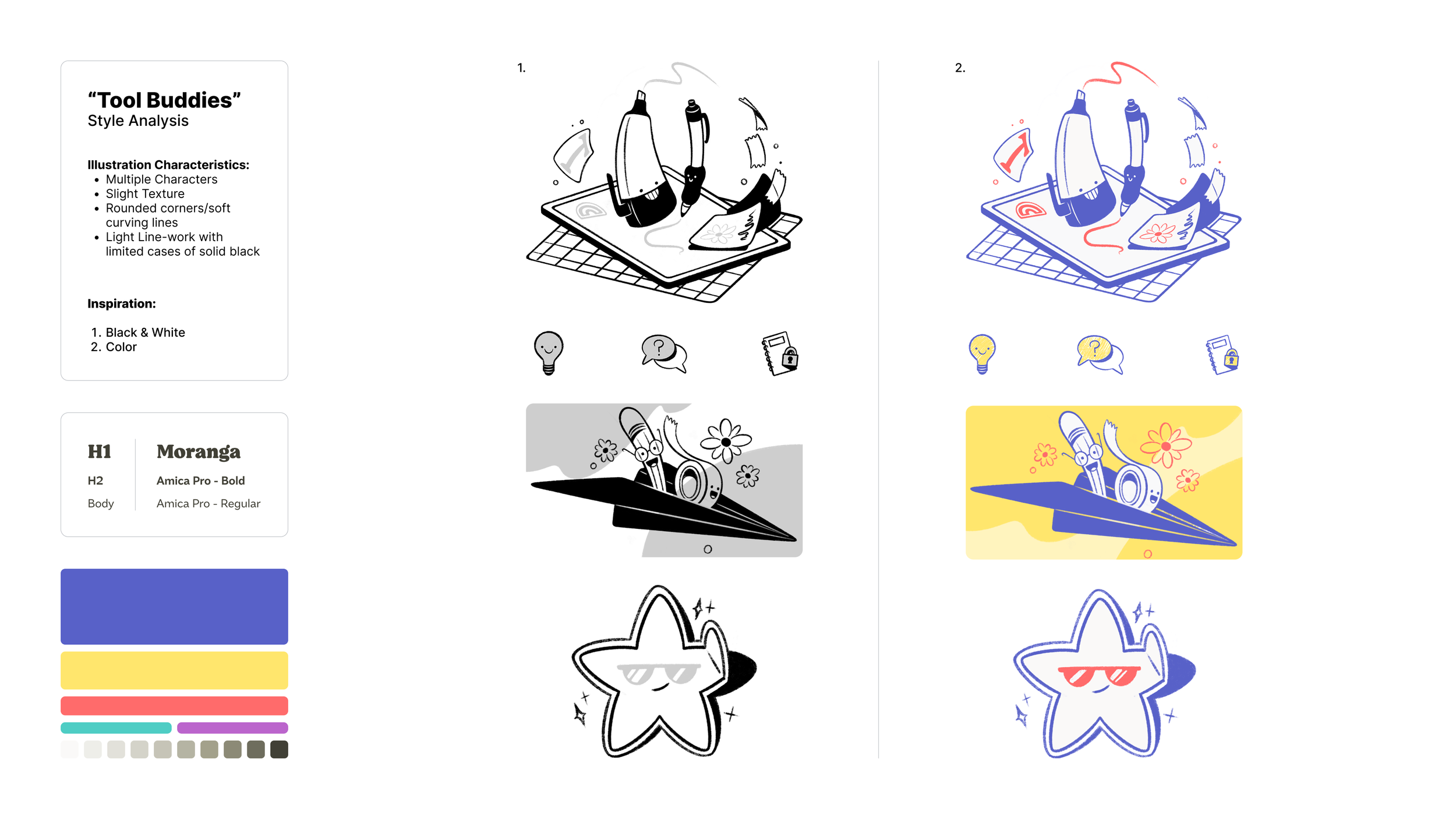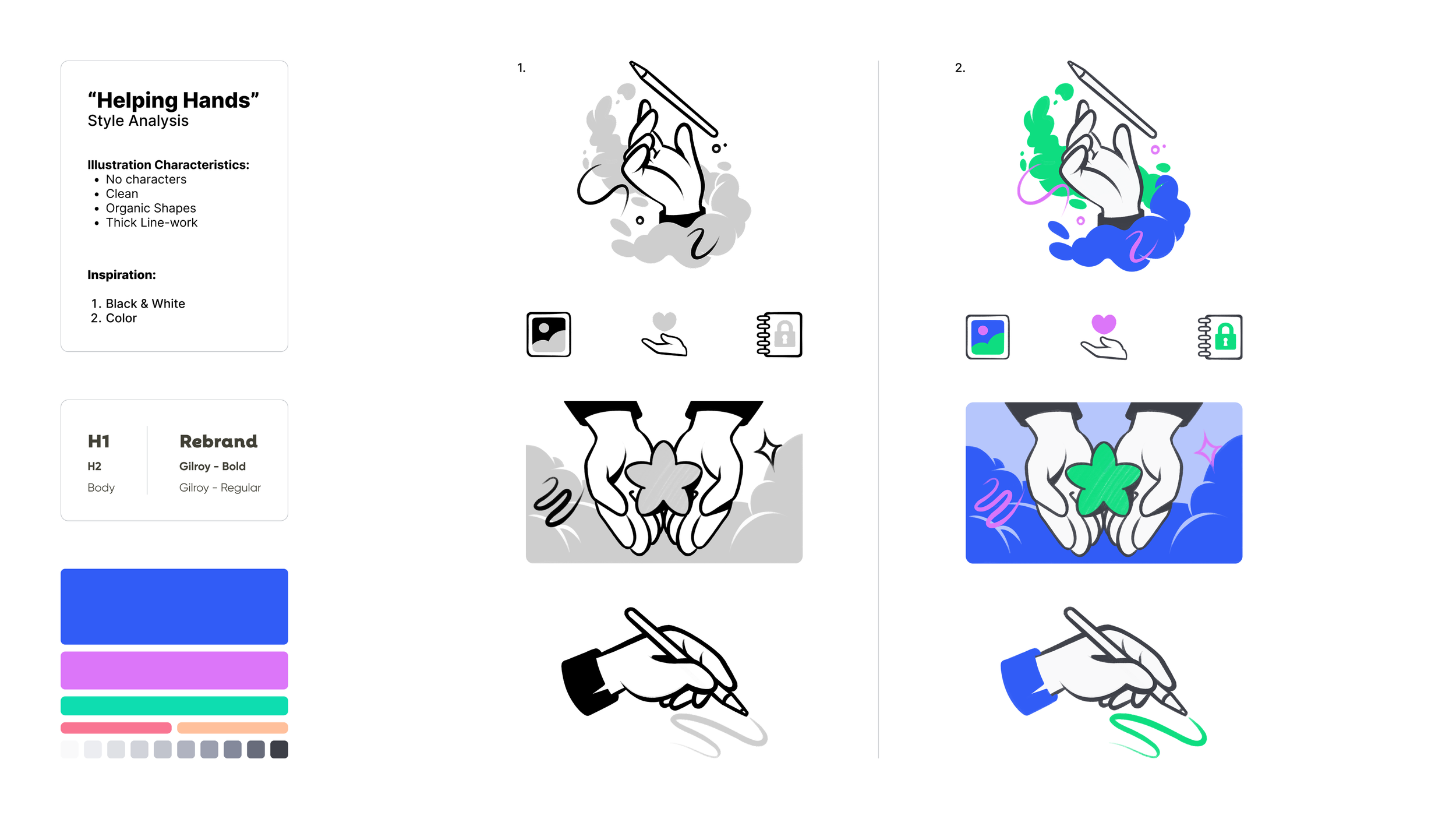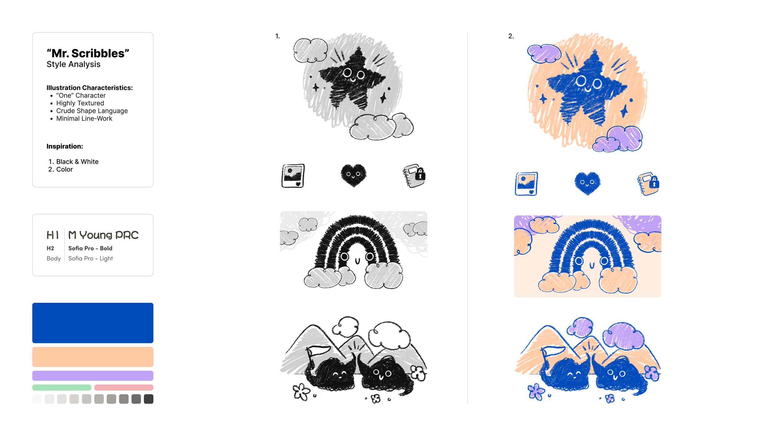
Notability:
Illustration Branding
Character-Driven Art Direction at Scale
Role: Visual Designer (acting Art Director)
Team: Internal Brand Team
Notability had strong product adoption but very little visual identity beyond a logo and the color blue. I led the definition of a new illustration-driven brand system to humanize the product, improve communication, and create a scalable visual foundation for future growth.
The Challenge
Notability is a productivity tool used heavily in high-focus, high-stress contexts—studying, exam prep, and deadline-driven work. The brand needed to communicate clearly while feeling supportive rather than utilitarian.
The challenge wasn’t just to achieve visual consistency, it was also about nailing emotional tone. This required a clear point of view on art direction, not just visual execution. The questions that I had to ask up-front were:
How do you make a tool feel like it’s on the user’s side?
How do you reduce friction without adding noise?
How do you create brand recognition without relying on heavy marketing assets?
Art Direction Strategy:
Why Character-Driven Illustration?
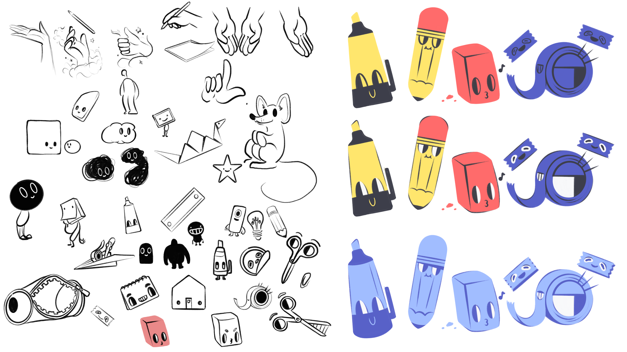
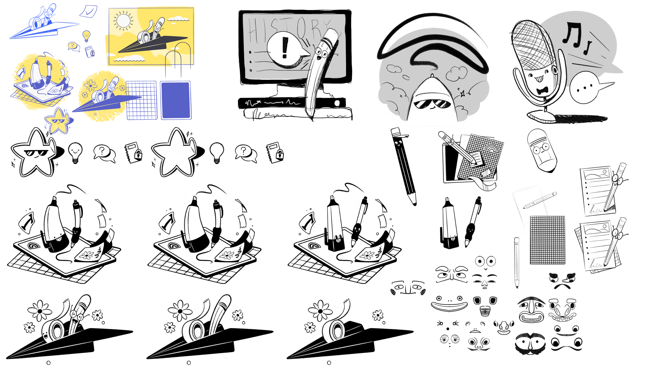
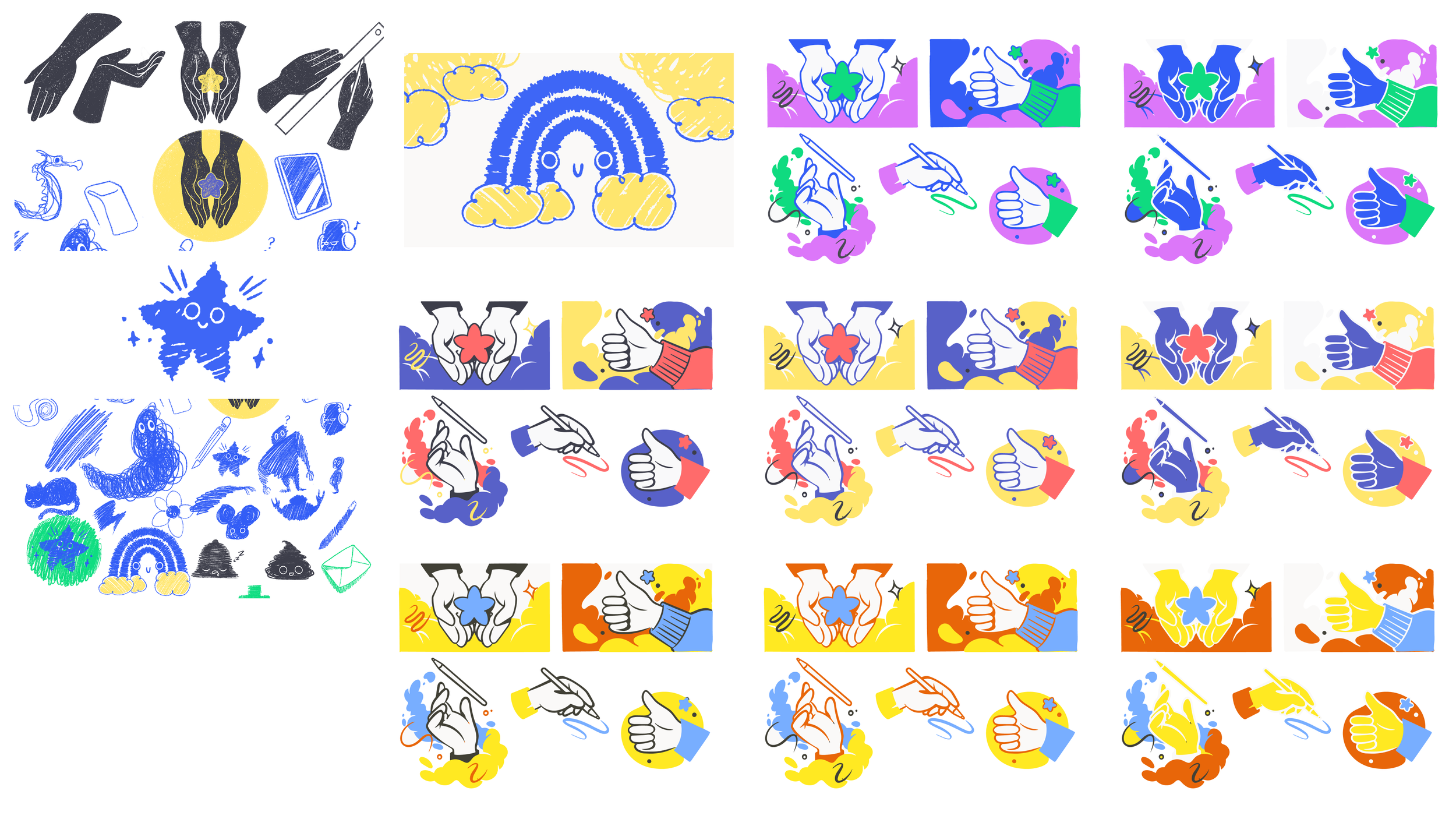
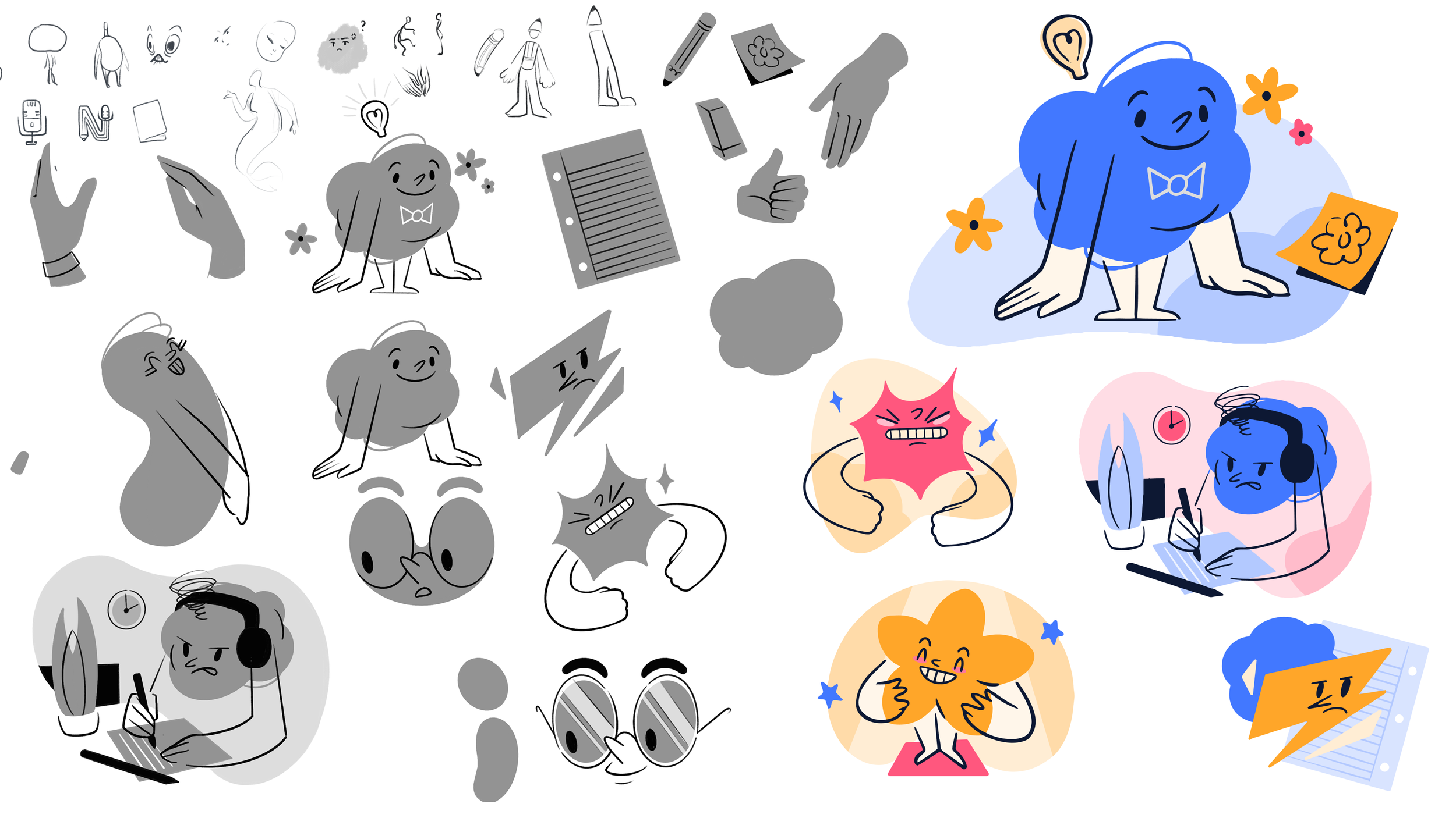
I set illustration as the foundation of the brand, and specifically pushed for a character-driven approach.
Illustration offered practical advantages—vector scalability, in-house production, fast iteration—but characters added something more important: human connection.
Characters:
Create immediate emotional cues
Form mental associations with the product
Make experiences more memorable and shareable
Turn moments of friction into moments of empathy
In a product people return to daily, recognition compounds through repeated interaction.